
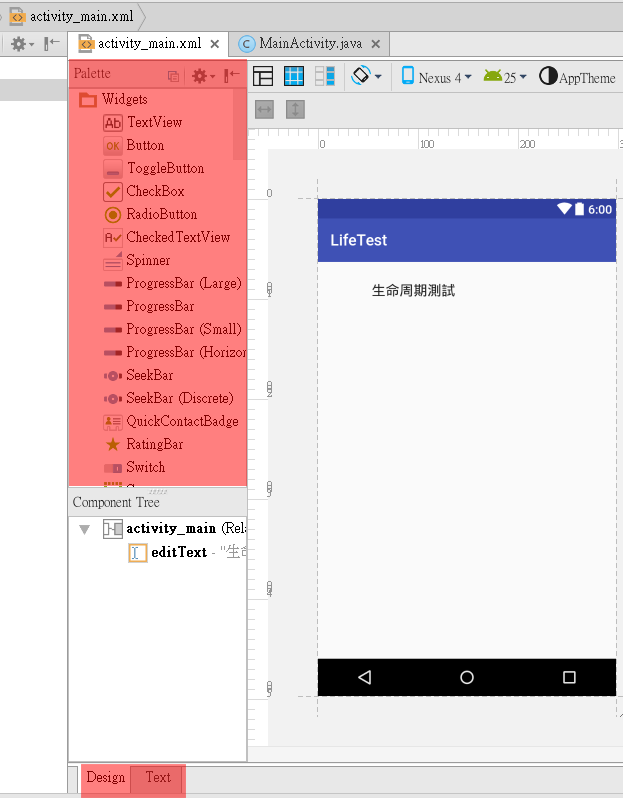
Palette
在Android Studio中, 打開res/layout裏面的任何一個xml檔案, 都是Activity的畫面設定. 畫面設定可以切換到Design模式進行圖形化設計, 也可以使用Text模式進行程式碼撰寫. 當使用圖形化設計時, 中間會有一個叫Palette[ˋpælɪt]的工具列, 這Palette翻譯成中文叫調色盤, 台灣大部份的人都稱這個為Widget(元件).
但元件其實包含了上千萬種, Activity, Service也是元件. 而中間這Palette大部份都是可以在視窗中看得到的元件, 所以, 就直接翻譯成畫面元件.
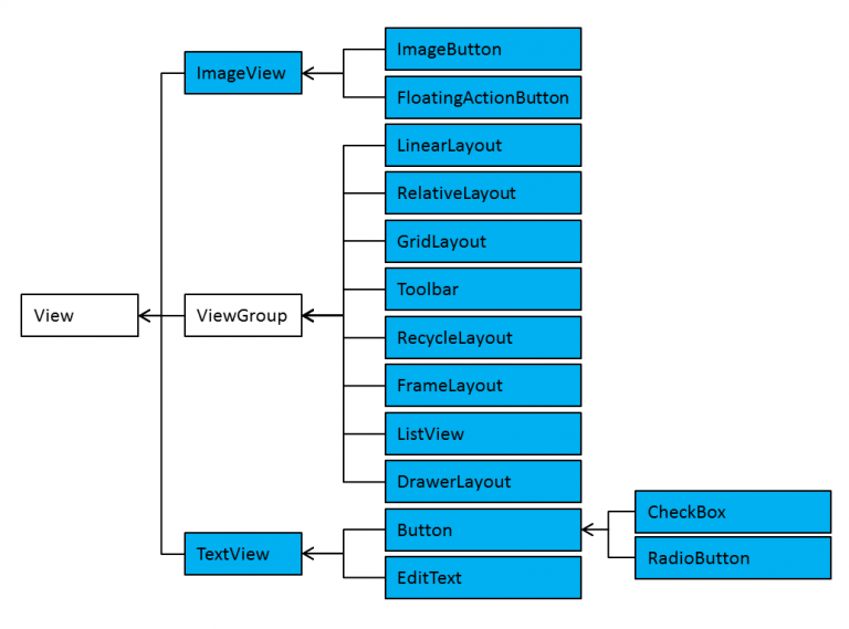
畫面元件階層圖
可視元件有Button, TextView, EditView, CheckBox等千百種. 也有好幾種Layout, 所以先列出如下各個元件的階層圖. 圖中的藍色部份, 就是大家所稱呼的元件(Widget)
大部份的UI配置, 都放在res/layout裏, 使用xml格式來描述, Android會將這xml轉換為資源名稱, 再由Java程式碼的setContentView(layout)載入.
也有少數直接把UI寫在Java程式中, 如下就只有一個按鈕, 佔滿整個畫面
public class MainActivity extends AppCompatActivity {
    @Override
    protected void onCreate(Bundle savedInstanceState) {
        super.onCreate(savedInstanceState);
        Button btn=new Button(this);
        btn.setText("自我毀滅按鈕");
        setContentView(btn);
    }
}
畫面元件設定
res/layout裏的檔名, 只能使用小寫, 副檔名為.xml. 如下所述, 在畫面中加入一個按鈕
<Button
    android:text="Button"
    android:layout_width="wrap_content"
    android:layout_height="wrap_content"
    android:layout_below="@+id/editText"
    android:layout_alignStart="@+id/editText"
    android:id="@+id/button" />
元件大小
每個畫面元件大都可以設定大小 android:layout_width, android:layout_height.
設為match_parent時則會填滿所用的空間, wrap_content則自動調整為可完整顯示內容的大小
也可以使用如下單位設定大小 px, dp, sp
使用px時, 是以實際螢幕的像素為單位, 比如寬度設定720px,則在720p的裝置上看起來會填滿整個螢幕寬度, 但在1080p上看起來就只會佔67%, 所以在不同的裝置會有不同的效果, 盡量少用.
使用dp的話, 會使用預設密度160進行因子轉換. 比如設定為80dp, 則在密度為480dpi的裝置上, 會畫出80*480/160=240px的寬度. 在320dpi的裝置上則畫出80*320/160=160px, 所以看起來的畫面比例會一樣
sp同dp, 但會隨著字体的大小而改變(有的人老花, 就會把字体調成特大號, 此時這寬度就會不一樣). 字体的大小設定, 只能使用sp
元件間隔
元件與元件的間隔稱為 android:margin, 元件與內容的間隔稱為android:padding
元件內容對齊方式
可以使用android:gravity方式對齊, 有top, bottom, left, right, center_vertical, center_horizontal, center, fill_vertical, fill_horizontal, fill
如下則使用了android:gravity=”right|center_vertical”
文字設定
如果是可以顯示文字的元件, 如TextView, Button, EditText等, 可以設定文字屬性
android:text 文字的肉容
android:textSize 文字大小
android:textApperance 使用系統預設的值, 如
?android:attr/textApperanceLarge
?android:attr/textApperanceMedium
?android:attr/textApperanceSmall
android:textColor 設定顏色, 可用#RRGGBB, #AARRGGBB, #RGB, #ARGB
android:background 設定背景色
常用元件屬性
常用元件有TextView, EditText, Button, CheckBox, RadioGroup, RadioButton, 屬性相當多, 僅列出常見需注意的
TextView
在autoLink中, 有email/web/phone 會加上底線, 按下後可開啟郵件程式, 網頁程式, 或撥號程式
EditText
在inputType中, 可指定要輸入的是email, Number, Phone, Datetime, Text等, 然後系統會開啟不同的鍵盤供使用者key in
Button
可設定 android:onClick=”bt1_click” 屬性, 指名按下後要執行的方法, 方法需寫於Activity元件中, 格式如下 : public void bt1_click(View v){}
多個按鈕可執行同一個方法, 在方法中取得是那個按鈕按下的方法如下程式碼
public void bt_click(View v){
    switch(v.getId()){
        case R.id.button1:
            break;
        case R.id.button2:
            break;
    }
}
CheckBox
CheckBox可由isChecked取得目前的狀況. 下述的程式碼, 因為使用了匿名類別, 所以CheckBox c1, c2必需宣告為物件變數(Field區)
Button b=(Button)findViewById(R.id.button2);
c1=(CheckBox)findViewById(R.id.checkBox);
c2=(CheckBox)findViewById(R.id.checkBox2);
b.setOnClickListener(new View.OnClickListener() {
    @Override
    public void onClick(View view) {
        if (c1.isChecked()){
           Toast.makeText(MainActivity.this, c1.getText(),Toast.LENGTH_LONG).show();
        }
        if (c2.isChecked()){
            Toast.makeText(MainActivity.this, c2.getText(),Toast.LENGTH_LONG).show();
        }
    }
});
RadioButton
RadioButton為單選, 需包含在RadioGroup之內, 如下為xml的設定
<RadioGroup
    android:layout_width="wrap_content"
    android:layout_height="wrap_content"
    android:layout_alignParentBottom="true"
    android:layout_alignEnd="@+id/button2"
    android:layout_marginBottom="93dp">

    <RadioButton
        android:text="RadioButton"
        android:layout_width="wrap_content"
        android:layout_height="wrap_content"
        android:layout_below="@+id/radioGroup"
        android:layout_alignParentStart="true"
        android:layout_marginStart="29dp"
        android:layout_marginTop="28dp"
        android:id="@+id/radioButton3"
        android:layout_weight="1"
        android:onClick="selectClick"/>

    <RadioButton
        android:text="RadioButton"
        android:layout_width="wrap_content"
        android:layout_height="wrap_content"
        android:layout_below="@+id/radioGroup"
        android:layout_alignParentStart="true"
        android:layout_marginStart="29dp"
        android:layout_marginTop="28dp"
        android:id="@+id/radioButton2"
        android:onClick="selectClick"/>
</RadioGroup>
開關元件
開關元件有ToggleButton 及 Switch二種, 用法同CheckBox, 使用isChecked來取得狀況. 這二個同是CompoundButton的之類別, 所以可以轉型為CompoundButton後, 一同使用
Layout
Android的Layout有LinearLayout, RelativeLayout, TableLayout, GridLayout
因Android Studio預設的Layout為RelativeLayout, 這個比較不好控制. 所以在開啟專案後, 立即把res/layout裏的xml先變更為LinearLayout, 此Layout比較簡單.
Layout中放入元件,若出現Missing styles. Is the correct theme chosen for this layout, 請由File/Invalidate Caches/Restart重新啟動
LinearLayout
width/height : 可使用wrap_content, match_parent, 但fill_parent禁止使用, 此效果同match_parent相同
anroid:orientation : horizontal/vertical
android:gravity : 裏面元件的左中右上下,比如設定layout, 則影響裏面的按鈕位置. 若設置在按鈕,則影響文字的位置
TableLayout
<TableLayout>
   <TableRow>
      <視圖1/> <視圖2/> <視圖3/>
   </TableRow>
   <TableRow>
      <視圖1/> <視圖2/> <視圖3/>
   </TableRow>
   <TableRow>
      <視圖1/> <視圖2/> <視圖3/>
   </TableRow>
</TableLayout>
TableLayout標籤屬性
android:stretchColumns==“0“ or “0,1“ or “*“ 指定欄位填滿剩於空間
android:shrinkColumns==“0“ or “0,1“ or “*“ 指定欄位縮小空間
Android:layout_column=2 指定放在第3欄位
Android:layout_span=“2“ 合併2個欄位
RelativeLayout
Android:layout_alignParentxxx : 往某處對齊
Android:layout_above, _below : 某元件之上下
Android:layout_toLeftOf, _toRightOf : 某元件之左右
如下設定指定距button6下方之距離
android:layout_below=”@+id/button6″
android:layout_alignParentStart=”true”
android:layout_marginStart=”38dp”
android:layout_marginTop=”50dp”
FrameLayout
FrameLayout裏的元件, 都有自己的z軸, 在元件使用setVisibility設定顯示狀況
setVisibility(View.VISIBLE) : 顯示元件
setVisibility(View.INVISIBLE) : 隱藏元件但不移除
setVisibility(View.GONE) : 移除元件
GridLayout
為TableLayout之改良版,具如下屬性
android:columnCount : 設定最大欄位
android:layout_gravity : 設定位置
元件
android:layout_column, android:layout_row : 元件欄及列
android:layout_columnSpan : 跨欄
android:layout_rowSpan : 跨列
Include & merg
將常用之layout獨立於一個xml檔
再於主layout使用include包含進來
若要消除重複之<LinearLayout>, 可改為<merg>
取得include內之元件
主layout如下
<include
android:id=”@+id/layout1″
layout=”@layout/drink_layout“ />
在Java程式碼中可撰寫如下
View v=findViewById(R.id.layout1);
RadioButton rb1=(RadioButton) v.findViewById(R.id.radioButton);
Hierarchy Viewer
C:\Users\Administrator\AppData\Local\Android\sdk\tools\hierarchyviewer.bat 可檢視apk之Layout結構