
CSS全名為 Cascading Stylesheets(階層樣式表),可以塑造網站的特殊風格。這比在標籤內使用屬性更為多樣化。
底下為使用屬性改變body背景的寫法
<body bgcolor="#ff0000">
    我的網頁
</body>
若使用 css 的寫法則為如下
<body style="background:#ff0000;">
    我的網頁
</body>
CSS 的用法,就是把樣式寫在 style 這個屬性裏面。雖然比較麻煩,但樣式多樣化,且 bgcolor 這個屬性在新版的 html 即將淘汰不能使用,所以使用 CSS 才是最佳的方案。
style標籤
CSS 除了可以寫在標籤內的 style 屬性,也可以獨立於 <style> 標籤內,如下方式
<html>
    <style>
        body, table{
            background-color:#ffff00;
        }
    </style>
    <head>
        <meta charset="UTF-8"/>
        <title>Title</title>
    </head>
    <body>
        我的網頁
    </body>
</html>
其格式為
<style>
    選擇器1{
        屬性:屬性值;
        屬性:屬性值;
        屬性:屬性值;
        .........
    }
    選擇器2{
        ........
    }
</style>
請注意,每個屬性之間,都必需使用 “;” 隔開
選擇器 Selector
選擇器有多個不同的類型
元素選擇器
元素選擇器可以為 html 的標籤,如下的 “table, p” 是指凡是表格,或是段落,都套用此格式
<style>
    table, p{
        background-color:#ffff00;
        border:solid;
        width:100%;
    }
</style>
<body>
    <p>這是段落</p>
    <table>
        <tr>
            <td>第一行</td>
        </tr>
    </table>
</body>
class選擇器
class選擇器的名稱必需以 “.” 開頭,然後在標籤中使用 class屬性引用。class選擇器可以套用到多個標籤。
<style>
    .div_green{
        background-color:#00ff00;
        width:100px;
        margin:10px;
    }
    .div_yellow{
        background-color:#ffff00;
        width:100px;
        margin:10px;
    }
</style>
<body>
    <div class="div_green">第一區塊</div>
    <div class="div_green">第二區塊</div>
    <div class="div_yellow">第三區塊</div>
</body>
id選擇器
id 選擇器的名稱需使用 “#” 開頭,然後在標籤中使用 id屬性引用。因為 id 是每個標籤的唯一值,所以id 選擇器只能套用到一個標籤。
<style>
    #id1{
        background-color:#00ff00;
        width:100px;
        margin:10px;
    }
    #id2{
        background-color:#ffff00;
        width:100px;
        margin:10px;
    }
</style>
<body>
    <div id="id1">第一區塊</div>
    <div id="id2">第二區塊</div>
</body>
虛擬class選擇器
特定狀況下,指定頁面的元素,比如滑鼠移到超連結時。如下的 “a” 為超連結,”hover”則為滑鼠移到上面時。底下又加了td:hover,此段可以讓滑鼠滑入儲存格後,背影變為綠色。
<style>
    a:hover{
        background-color:#ffff00;
    }
    td:hover{
        background-color:#00ff00;
    }
</style>
<body>
    <a href="http://mahaljsp.asuscomm.com">Mahaljsp</a>
</body>
CSS註解
CSS也可以註解,分為單行註解 “//……… ;“,及多行註解 /*….*/。
請注意,單行註解一定要以 “;”結束,否則會影響到連下一行也註解。
<style>
    table{
        /*整個表格置中*/
        margin: 0 auto;//整個表格置中;
        border : 1px solid #0000ff;
        font-size:16px;
        width:250px;
        //內容文字置中;
        text-align:center;
        //border-collapse:collapse;此行不執行
    }
獨立CSS檔
上述的 CSS 樣式,可以獨立於一個檔案,比如放在 styles/style.css。請注意,檔案裏不能加 <style> 標籤,如下所示 :
body, p{
    background-color:#ffff00;
}
a:hover{
    background-color:#00ff00;
}
然後在html裏的 <head>標籤中,加入如下 <link href=”styles/style.css” rel=”stylesheet” type=”text/css”>
<head>
    <link href="styles/style.css" rel="stylesheet" type="text/css"/>
    <title>Title</title>
</head>
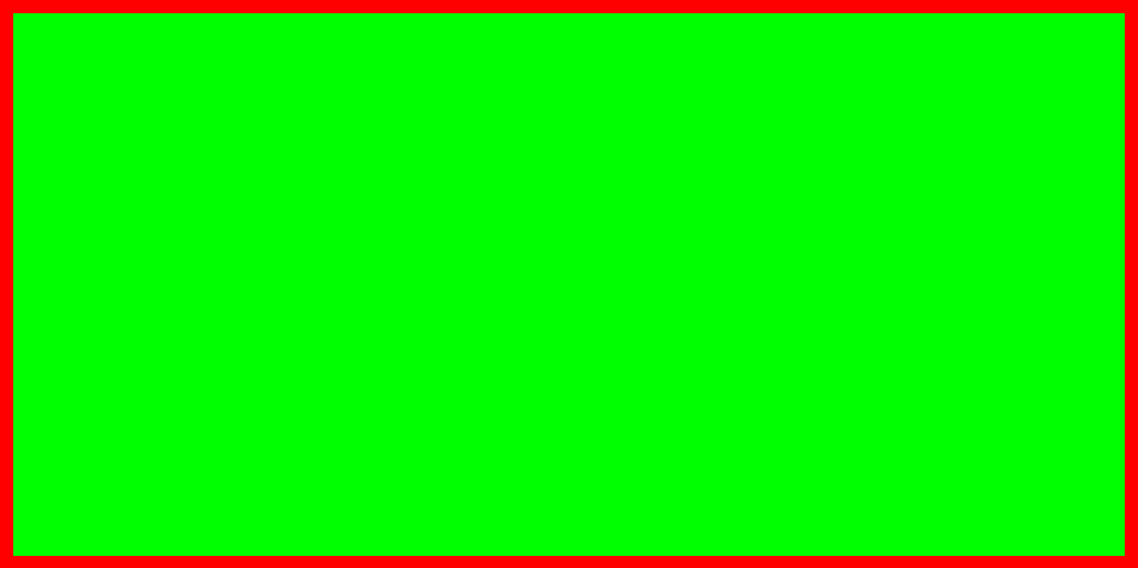
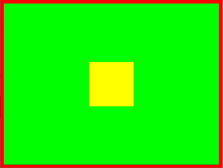
html 與 body
html 與 body各有不同的區域,下圖紅色區為 html 的區域,綠色區為 body的區域,可用如下的 html 語法得知。body的預設margin 為 8。
如果將 body 的 margin 設為 0 : margin:0,則 body 的綠色區域就會全部蓋掉 html 的紅色區域
<html>
    <head>
        <meta charset="UTF-8"/>
    </head>
   <style>
      html{
         background:#ff0000;
      }
      body{
         background:#00ff00;
         //margin:8;
      }
   </style>
    <body>
    </body>
</html>
div 佈局
div 用於佈局蠻好用的,比如 banner 需 50px,footer 需 25px,剩餘的全部分配給中間。這種需於最外側 body 或 div 使用 100%(vh) 把高度設為 100%,display 設為 flex 容器,方向為 column,最後中間佔滿剩餘的部份使用 flex:1 或 flex-grow:1。
<body style="height:100vh;display:flex;flex-direction:column;margin:0;">
    <div style="width:100%;background-color:#c0c0ff;height:50px;"></div>
    <div style="width:100%;background-color:#ffffa0;flex:1;"></div>
    <div style="width:100%;background-color:#9090ff;height:25px;"></div>
</body>
結果如下
position
static : 預設值,依瀏覽器預設的配置自動排版。
relative : 設定top, right, bottom, left來位移原本應該出現的位置
<style>
   .div1{
      background:#ffff00;
      width:100px;
      height:100px;
      position: relative;
      top: 10px;
      left:10px;
   }
</style>
<body>
   <div class="div1">
   </div>
</body>
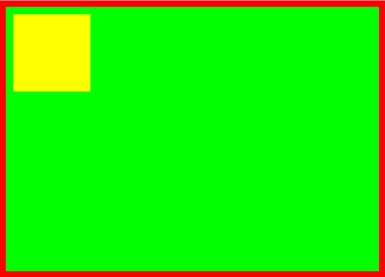
fixed: 固定在瀏覽器指定的位置,即便是頁面捲動,它還是在相同的位置不會動。
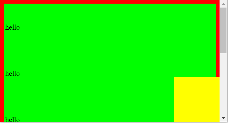
<style>
   .div1{
      background:#ffff00;
      width:100px;
      height:100px;
      position: fixed;
      bottom: 10px;
      right:10px;
   }
</style>
<body>
   <div class="div1">
   </div>
</body>
absolute : 類似於 fixed,不過absolute是以上層的容器為基準點,如果沒有上層容器,則以目前頁面(html)為基準點,absolute會隨捲軸移動。
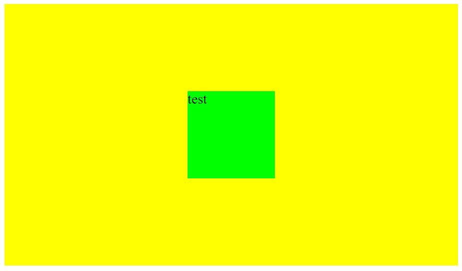
div區塊水平
如果子 div 區塊要在父 div 區塊水平置中,則父區塊需設定為 “display:flex;flex-direction:column;”
然後 “align-items:center” 是水平置中,”justify-content:center;” 則是垂直置中。
<body>
<div style="background-color:#ffff00;height:300px;
    display:flex;flex-direction:column;
    align-items:center;justify-content:center;">
    <div style="width:100px;background-color:#00ff00;height:100px;">
        test
    </div>
</div>
</body>
div 在 body 水平垂直置中
如果 div 區塊要在 body 水平垂直置中,建議先在 body 中加上寬高都是 100% 的父 div, 然後將子 div 依上述的方法置中。
如果不想加父 div , 就比較麻煩了,。首先將 position設為 absolute或fixed, 因為基準定位點都是body。然後top及left各設為 50%。不過這 50%是以div的左上角為基準點,所以需再用使用 transform將左上角進行位移。
<style>
    .div1{
      background:#ffff00;
      width:100px;
      height:100px;
      position: absolute;
      top: 50%;
      left:50%;
      transform: translate(-50%, -50%);
   }
</style>
<body>
    <div class="div1">
    </div>
</body>
div內的文字水平垂直置中
div內的文字若要水平垂直置中,網路上有千百種方法,但正確的沒幾個。
本人試過最好的方式就是
display 設定為flex : display:flex
水平設定為 justify-content:center; 請注意,display為flex時,text-align:center 會失效。然後在 <p>中設定 text-align:center
垂直設定為 align-content:center; flex-wrap:wrap; 請注意,沒有flex-wrap時,垂直置中會失效。
完整代碼如下
<style>
    .div1{
        background:#ffff00;
        width:200px;
        height:200px;
        display : flex;

        //底下是水平置中的設定;
        justify-content: center;
        //底下是垂直置中的設定;
        align-content: center;
        flex-wrap: wrap;
    }
</style>
<body>
    <div class="div1">
        <p style="width:100%;text-align:center;">水平垂直置中</p>
        <p style="width:100%;text-align:center;color:#0000ff;">第二行</p>
    </div>
</body>
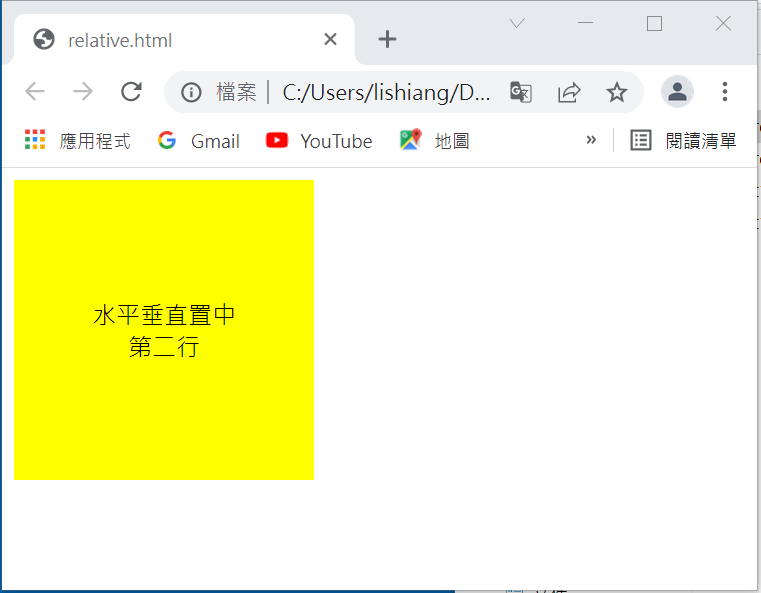
請注意,
在 <div> 內,因為設定 flex-wrap 為 wrap (包含內文) ,所以段落的寬度一定要設定為 <p width=”100%”>,
如此段落才能置中。
如果將上述的width及height都改為 100%的話,那麼二行的文字就會水平垂直置中於整個網頁中心了。
body常用CSS
<style>
    body, html{
        border: 1px solid;
        height: 99%;
        margin:0;
        //background-color:#ff00ff;
        //padding: 10px 10px 10px 10px;
    }
</style>
表格常用CSS
表格外框線 : table及td都必需設定 border:1px solid;
cellpadding/cellspacing則需在 table 中改為 border-collapse:collapse;(坍塌)
margin-left:auto;margin-right:auto; 會讓表格水平置中
text-align: center; 會讓表格內的文字置中
<style>
    table{
        margin: 0 auto;//整個表格置中;
        border : 1px solid #0000ff;
        font-size:16px;
        width:250px;
        text-align:center;//內容文字置中;
        border-collapse:collapse;
        text-align:center;
        margin-left:auto;
        margin-right:auto;
    }
    tr{
        border:1px solid #000000;
    }
    td{
        border:1px solid #000000;
        padding:1px;
    }
</style>
<body>
    <table>
        <tr>
            <td colspan="2">會員登入系統</td>
        </tr>
        <tr>
            <td>帳號</td>
            <td><input type="text"/></td>
        </tr>
        <tr>
            <td>密碼</td>
            <td><input type="password"/></td>
        </tr>
        <tr>
            <td colspan="2">
                <input type="button" value="登入"/>
            </td>
        </tr>
    </table>
</body>
元件重疊
父區塊 position:relative,要重疊的子區塊 position:absolute, 然後設定子區塊的 z-index。z-index 愈大就愈上層。
todo