Chartify
chartify 是將日記帳轉成圖形化的套件。
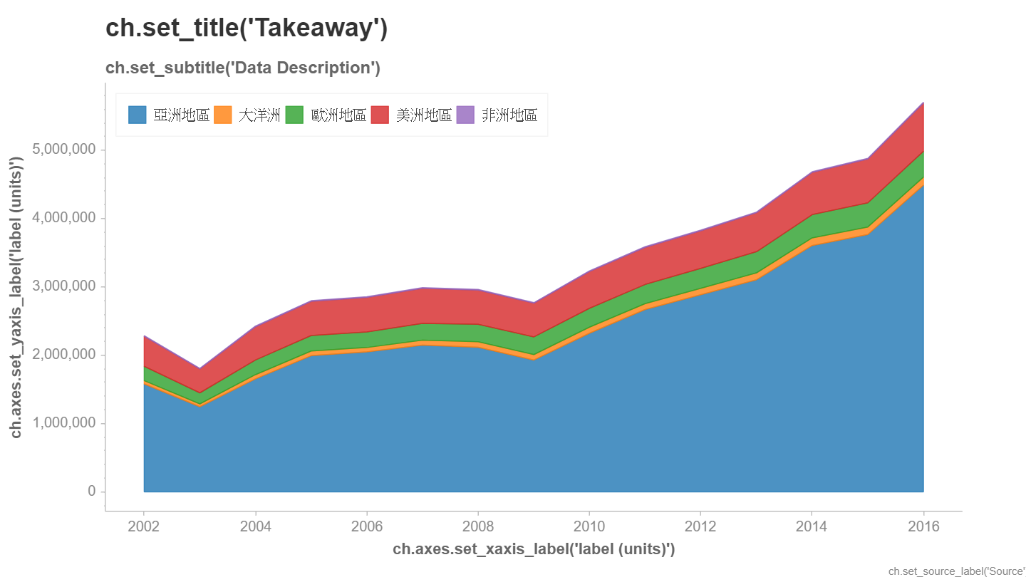
Area Chart
請先由下網址下載來台旅遊人數 csv 檔 https://data.gov.tw/dataset/45537
請先安裝如下套件
pip install pandas openpyxl chartify
完整程式碼如下
#pip install chartify pandas openpyxl
import chartify
import pandas as pd
df=pd.read_csv("歷年來台旅客國籍統計2002-2025.csv")
df=df[df["細分"].str.contains("合計 Total", na=False)]
print(df)
years = [str(y) for y in df.columns[2:]]
data = df.melt(
    id_vars="國籍",     # 固定不轉換的欄位
    value_vars=years,   # 那些欄位要攤平
    var_name="year",    # 年份欄名稱
    value_name="qty"    # 數量欄名稱
).rename(columns={"國籍":"area"})
data["qty"] = (
    data["qty"]
    .astype(str)
    .str.replace(",", "")
    .astype(int)
)

print(data)

ch=chartify.Chart(x_axis_type='datetime')
ch.plot.area(data_frame=data,
             x_column='year',
             y_column='qty',
             color_column='area',
             stacked=True)
ch.show()

#data=[]
#for i in range(df.shape[0]):
#    for j in range(2,df.shape[1]):
#        qty=df.iloc[i,j]
#        area=df.iloc[i,0]
#        year=str(df.columns[j])#年需轉成字串
#        data.append([area, year, qty])
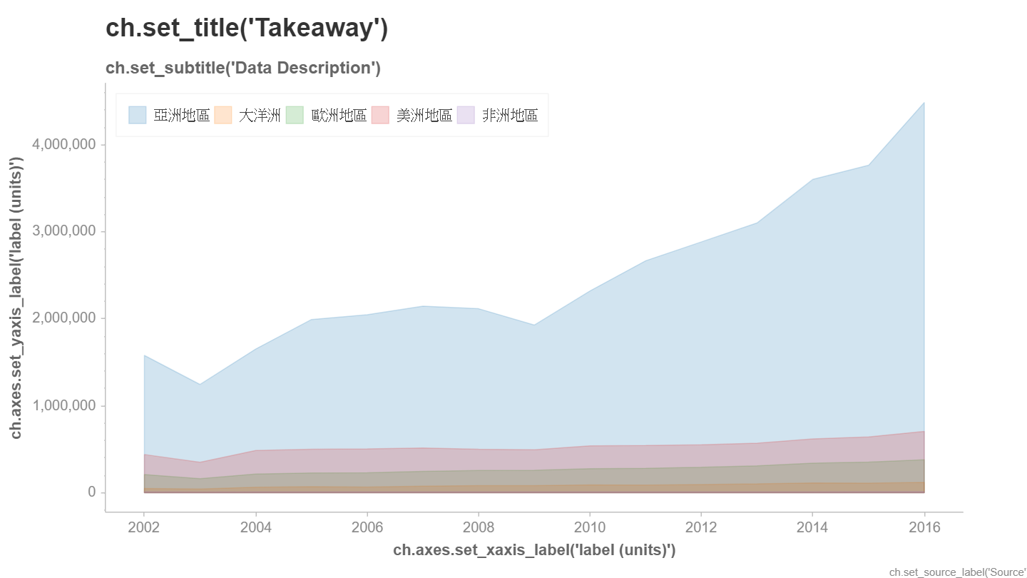
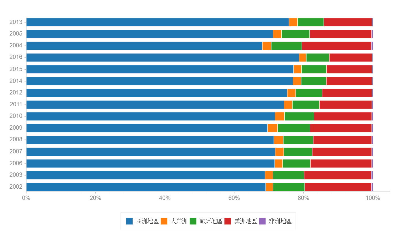
取消疊加 : 上述繪圖時, stacked=False的顯示結果如下
底下是另一種寫法,使用 df.T 轉成垂直方向
import pandas as pd
import chartify
pd.set_option('display.max_columns', None)
pd.set_option('display.max_rows', None)
pd.set_option('display.width', None)
pd.set_option('display.max_colwidth', None)
df=pd.read_excel("travel.xlsx")
areas=df['國籍'].values
print(areas)
df=df.drop("國籍", axis=1)
df=df.drop("細分", axis=1)
df=df.T#置轉 90 度
year=[str(x) for x in df.index]
df=pd.DataFrame(data=df.values, columns=areas)
print(df)
data=[]
for area in areas:
    a=[area for i in range(len(year))]
    data+=zip(a, year, df[area])
df=pd.DataFrame(data=data, columns=['area', 'year', 'qty'])
print(df)
ch=chartify.Chart(x_axis_type='datetime')
ch.plot.area(data_frame=df,
             x_column='year',
             y_column='qty',
             color_column='area',
             stacked=True)
ch.show()
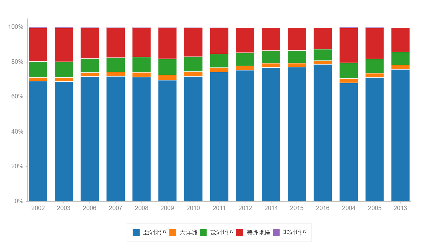
Categorical Chart
categorical [͵kætəˋgɔrɪk!] 在統計學上稱為類別資料, 屬於分類的資料(如血型). 在chartify則用於繪制各種狀況的比率.
底下的代碼, x軸為年度 (categorical_column分類欄), y 軸(stack_column疊加欄)為地區, 數字欄為 人數
在產生ch物件時, 需指定x軸種類為 x_axis_type=’categorical’
legend_location設定為 outside_buttom, 則可將圖例置於下方
import pandas as pd
import chartify
pd.set_option('display.max_columns', None)
pd.set_option('display.max_rows', None)
pd.set_option('display.width', None)
pd.set_option('display.max_colwidth', None)
df=pd.read_excel("travel.xlsx")
data=[]
for i in range(df.shape[0]):
    for j in range(2,df.shape[1]):
        qty=df.iloc[i,j]
        area=df.iloc[i,0]
        year=str(df.columns[j])#年需轉成字串
        data.append([area, year, qty])
df=pd.DataFrame(data=data, columns=['area', 'year', 'qty'])
ch=chartify.Chart(blank_labels=True,x_axis_type='categorical')
ch.plot.bar_stacked(
    data_frame=df,
    categorical_columns='year',
    stack_column='area',
    numeric_column='qty',
    normalize=True
)
ch.set_legend_location('outside_bottom')
ch.show()
xy軸轉向
只需在產生 ch 物件時, 分類軸改為 y 軸即可
import pandas as pd
import chartify
pd.set_option('display.max_columns', None)
pd.set_option('display.max_rows', None)
pd.set_option('display.width', None)
pd.set_option('display.max_colwidth', None)
df=pd.read_excel("travel.xlsx")
data=[]
for i in range(df.shape[0]):
    for j in range(2,df.shape[1]):
        qty=df.iloc[i,j]
        area=df.iloc[i,0]
        year=str(df.columns[j])#年需轉成字串
        data.append([area, year, qty])
df=pd.DataFrame(data=data, columns=['area', 'year', 'qty'])
ch=chartify.Chart(blank_labels=True,y_axis_type='categorical')
ch.plot.bar_stacked(
    data_frame=df,
    categorical_columns='year',
    stack_column='area',
    numeric_column='qty',
    normalize=True
)
ch.set_legend_location('outside_bottom')
ch.show()
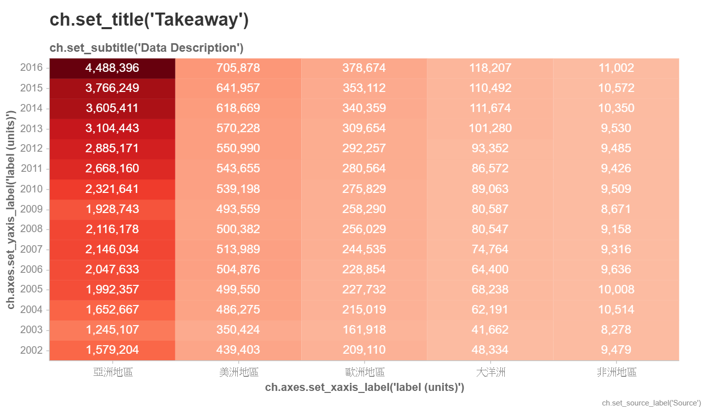
heatmap
熱度圖, 請看下面代碼
import chartify
import pandas as pd
pd.set_option('display.max_columns', None)
pd.set_option('display.max_rows', None)
pd.set_option('display.width', None)
pd.set_option('display.max_colwidth', None)
df=pd.read_excel("travel.xlsx")
#print(df)
data=[]
for i in range(df.shape[0]):
    for j in range(2,df.shape[1]):
        qty=df.iloc[i,j]
        area=df.iloc[i,0]
        year=str(df.columns[j])#年需轉成字串
        data.append([area, year, qty])
df=pd.DataFrame(data=data, columns=['area', 'year', 'qty'])
ch = chartify.Chart(x_axis_type='categorical',y_axis_type='categorical')
ch.plot.heatmap(
    data_frame=df,
    y_column='year',
    x_column='area',
    color_column='qty',
    text_column='qty',
    color_palette='Reds',
    text_format='{:,.0f}')
ch.show()
範例資料
Chartify是用來統計流水帳的一個套件. 其圖表是產生html後, 使用網頁瀏覽器顯示. 但產生的html及javascript在IE上的支援度不好, 有時用IE會看不到結果. 所以請把預設使用的瀏覽器改為Chrome.
chartify怕我們一時找不到資料, 所以裏面內藏了一大筆資料可以用, 使用如下方法, 即可產生DataFrame的資料表格. 這裏面有每一天每一國家不同水果的單價及銷售數量, 共1000筆資料
import pandas as pd
import chartify
df=chartify.examples.example_data()
print(df)
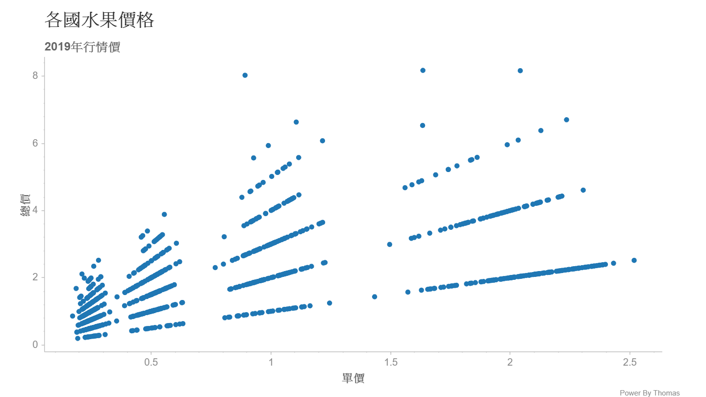
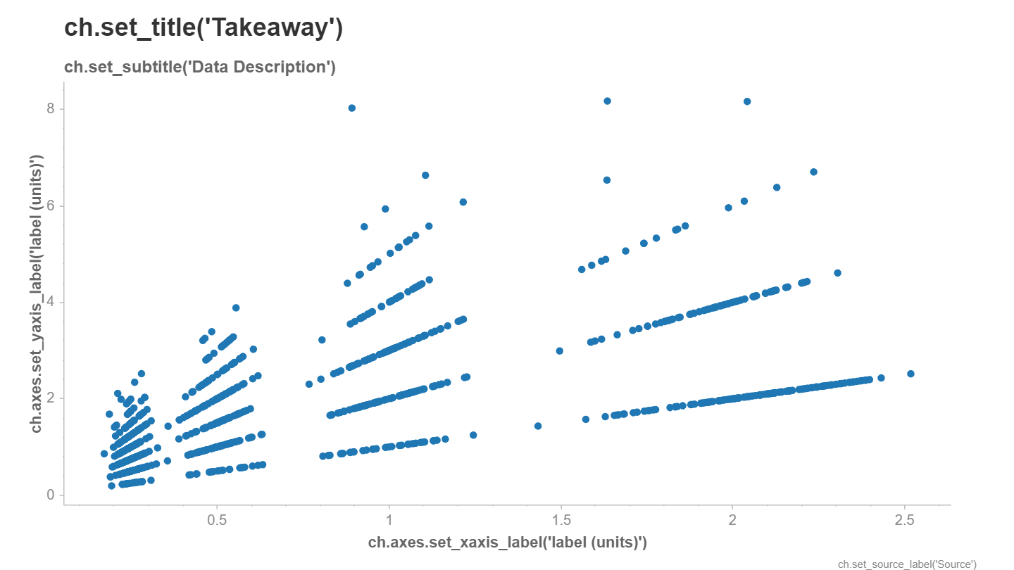
Scatter Chart
scatter[ˋskætɚ] 分散
底下簡易的代碼, 可以畫出x軸為單價, y軸為總價的圖表. 首先使用chartify.Chart()產生一個 ch圖表物件, 然後再使用ch.plot.scatter()指定圖表種類, 其資料來源為data_frame, 並指定x, y軸欄位即可, 最後記得使用 ch.show().
ch.show()可以產生一個html 檔, 並交由 瀏覽器顯示. show(‘png’)即表示直接輸出成圖片, 但此作法會使用selenium 並啟用headless chromedriver顯示, 因為是headless, 所以意義不大
import pandas as pd
import chartify
df=chartify.examples.example_data()
ch=chartify.Chart()
ch.plot.scatter(data_frame=df, x_column='unit_price', y_column='total_price')
ch.show()
圖表資訊
圖表資訊包含了圖表標題, 副標, X、Y 軸標籤, 圖片的數據來源等等, 這些都可以一一修改
預設沒有標題, x, y軸標籤時, 會提示使用什麼方法來設定, 如果不想看到這些訊息, 可以在產生ch物件時設定
ch=chartify.Chart(blank_lables=True)
若要手動設定時, 可參照如下代碼
import pandas as pd
import chartify
df=chartify.examples.example_data()
ch=chartify.Chart()
ch.plot.scatter(data_frame=df, x_column='unit_price', y_column='total_price')
ch.set_title('各國水果價格')
ch.set_subtitle('2019年行情價')
ch.axes.set_xaxis_label('單價')
ch.axes.set_yaxis_label('總價')
ch.set_source_label('Power By Thomas')
ch.show()